


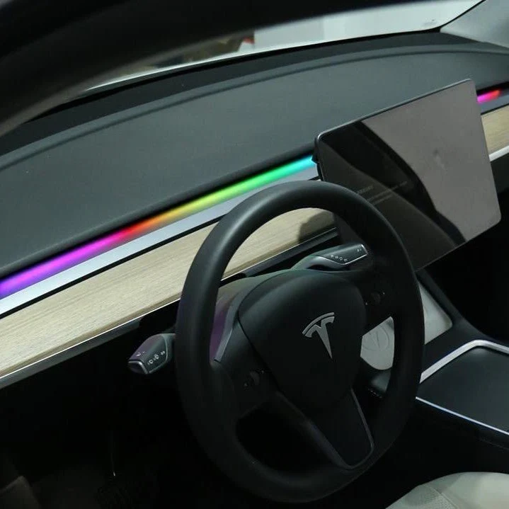


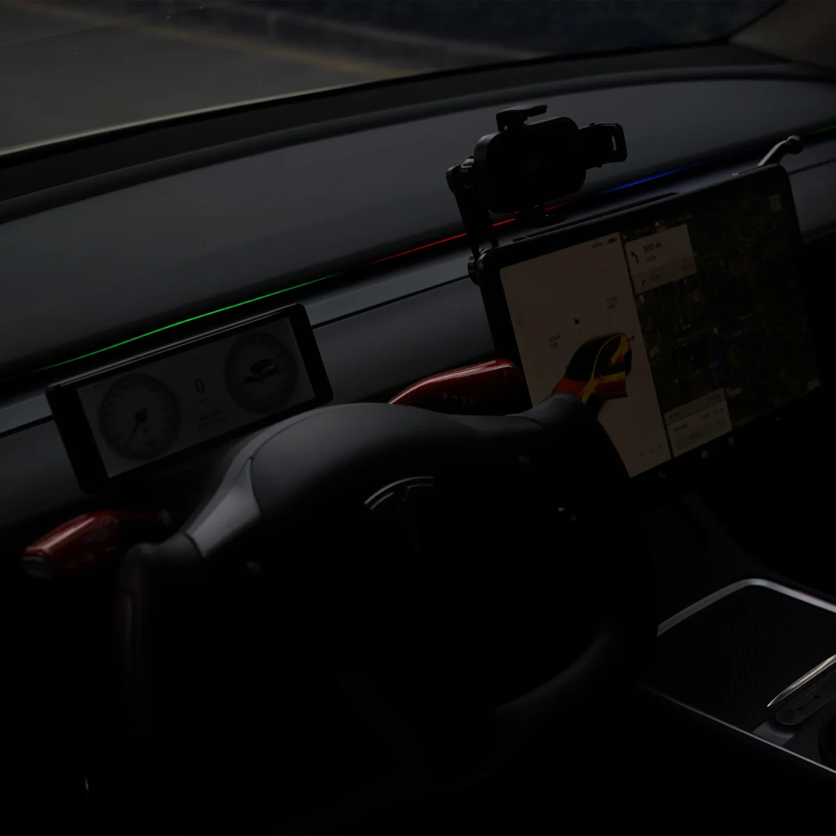
Descrição
/* Basic Styles */
body {
font-family: Arial, sans-serif;
margin: 0;
padding: 0;
background-color: white; /* Ensure background is pure white */
}
/* — APP CONTROL SECTION (Single Line) — */
.app-control-section {
max-width: 1200px;
/* Adjusted bottom margin for separation */
margin: 40px auto 20px auto;
padding: 0 20px;
text-align: left;
}
/* Main Title for the section – REMOVED */
.app-control-header {
/* This class is now redundant but kept hidden in case it needs to be restored */
display: none;
}
/* Container for the Mode Tags */
.mode-tags {
display: flex;
gap: 15px; /* Spacing between mode tags */
align-items: center;
flex-wrap: wrap;
padding-bottom: 10px; /* Padding for mobile view/wrapping */
}
/* Individual Mode Tag Style – Kept as is */
.mode-tag {
font-size: 14px;
font-weight: 600;
padding: 8px 12px;
border-radius: 6px;
transition: transform 0.2s, box-shadow 0.2s;
cursor: default;
display: flex;
align-items: center;
white-space: nowrap;
border: none;
box-shadow: 0 2px 5px rgba(0, 0, 0, 0.1);
}
/* Remove the color indicator dot (::before) */
.mode-tag::before {
content: none;
}
/* Mode 1: Smart APP Control (Grey/Neutral Background) – NO CHANGE */
.mode-tag.smart {
background-color: #666666; /* Medium Dark Grey */
color: #FFFFFF; /* White text for contrast */
}
/* Mode 2: Monochrome Mode (Black Background) – NO CHANGE */
.mode-tag.mono {
background-color: #000000; /* Pure Black */
color: #FFFFFF; /* White text for contrast */
}
/* Mode 3: Colorful Streaming Light Mode (Vibrant Gradient Background) – NO CHANGE */
.mode-tag.color {
/* Use a colorful gradient for the background */
background-image: linear-gradient(to right, #FF4136, #FFDC00, #2ECC40, #0074D9); /* Multi-color gradient */
color: #000000; /* Black text for readability on lighter parts of gradient */
font-weight: bold; /* Bold text for better pop */
}
/* Hover effect */
.mode-tag:hover {
transform: translateY(-2px);
box-shadow: 0 4px 8px rgba(0, 0, 0, 0.2);
}
/* ————————————- */
/* Header Container Style (Outer) */
.feedback-gallery-header-container {
/* Adjusted top margin */
margin: 10px auto 20px auto;
max-width: 1200px;
padding: 0 20px;
}
/* Header Style – Original Gallery Header */
.feedback-gallery-header {
font-size: 24px;
font-weight: bold;
margin-bottom: 20px;
text-align: left;
position: relative;
}
/* Gradient Title – Black to Black for pure black text */
.feedback-gallery-header span {
background-image: linear-gradient(to right, #000000, #000000);
-webkit-background-clip: text;
-webkit-text-fill-color: transparent;
transition: all 0.3s ease;
}
/* Container Style – MODIFIED: border-radius set to 0 */
.feedback-gallery-section {
width: 100%;
max-width: 1200px;
margin: 0 auto;
padding: 10px 20px;
background-color: white;
border-radius: 0; /* REMOVED ROUNDED CORNERS (MADE RECTANGULAR) */
box-shadow: 0 2px 10px rgba(0, 0, 0, 0.1);
overflow: hidden;
}
/* Scrolling Container */
.review-slider {
display: flex;
overflow-x: auto;
scroll-snap-type: x mandatory;
scroll-behavior: smooth;
white-space: nowrap;
padding: 0 20px 10px 20px;
}
/* Scrollbar and Image Spacing */
.review-slider::-webkit-scrollbar {
height: 12px;
background-color: transparent;
margin-top: 10px;
}
/* Custom Scrollbar Design – Black only */
.review-slider::-webkit-scrollbar-thumb {
background-image: linear-gradient(to right, #000000, #000000); /* Black to Black for pure black thumb */
border-radius: 16px;
border: 2px solid #fff;
box-shadow: inset 0 0 4px rgba(0, 0, 0, 0.2);
transition: all 0.3s ease;
}
/* Slider Thumb Scale on Hover */
.review-slider:hover::-webkit-scrollbar-thumb {
transform: scale(1.2);
}
/* Each Image Item – MODIFIED: border-radius set to 0 */
.review-item {
flex-shrink: 0;
width: 200px;
height: 200px;
margin: 0 10px;
border-radius: 0; /* REMOVED ROUNDED CORNERS (MADE RECTANGULAR) */
overflow: hidden;
scroll-snap-align: start;
transition: transform 0.3s ease;
cursor: pointer;
}
/* Image Hover Effect */
.review-item:hover {
transform: scale(1.05);
box-shadow: 0 4px 12px rgba(0, 0, 0, 0.1);
}
/* Image Style */
.review-item img {
width: 100%;
height: 100%;
object-fit: cover;
}
Customer Feedback Gallery


Avaliações
Ainda não existem avaliações.